
+ 1.202.421-5747
Ashburn, Virginia, USA 20147
hello@xwebbuilders.com
 Alex
Alex
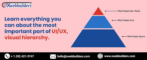
In the realm of UI/UX design, visual hierarchy holds immense significance as it guides users' attention and creates a seamless user experience. Visual hierarchy refers to the arrangement, size, color, and contrast of design elements to establish a clear order of importance. By strategically organizing elements, designers can direct users' focus, prioritize information, and guide them through the interface. In this way, our website development company Ashburn USA visual hierarchy plays a crucial role in enhancing user engagement, facilitating efficient navigation, and ensuring effective communication. Understanding the principles and techniques of visual hierarchy empowers designers to create visually appealing and intuitive user interfaces that effectively convey information and drive user interaction.
UI visuals play a vital role in creating an engaging and visually appealing user interface. They contribute to the overall user experience by communicating information, guiding users, and eliciting specific emotions. Here are some key aspects of UI visuals:
Colors: Color choice is crucial in UI design as it sets the overall mood and helps convey meaning. Different colors evoke different emotions and can be used to highlight important elements or establish visual hierarchy. Consistent color schemes and contrast can improve readability and enhance the overall aesthetic appeal.
Typography: Typography selection and arrangement influence the readability and visual impact of the interface. Fonts should be legible and appropriately sized for different screen sizes. Combining different font weights and styles can be used to create visual contrast and highlight key information.
Icons and Imagery: Icons and imagery are powerful visual elements that aid in communicating concepts and actions. They provide visual cues that enhance usability and guide users through the interface. Consistent iconography and imagery style help create a cohesive visual language.
Layout and Grids: The layout and grids structure the placement of UI elements, ensuring visual harmony and alignment. Grid systems provide a framework for organizing content, enabling a consistent and balanced layout. Proper spacing and alignment contribute to a clean and organized interface.
Visual Hierarchy: Visual hierarchy determines the order of importance and guides users' attention. By using size, color, contrast, and positioning, designers can create a clear visual hierarchy that directs users to focus on the most important elements first. This enhances usability and ensures a smooth user experience.
Motion and Animation: Motion and animation can add interactivity and engagement to the UI. They can be used to provide feedback, reveal hidden information, or guide users' attention. Thoughtful and purposeful animations can make the interface feel dynamic and intuitive.
Consistency: Consistency in UI visuals creates familiarity and helps users navigate the interface more easily. Consistent use of visual elements such as colors, typography, icons, and spacing across different screens and interactions provides a cohesive and intuitive user experience.
By paying attention to these aspects of UI visuals, designers can create visually appealing, user-friendly interfaces that effectively communicate information, guide users, and enhance the overall user experience. The careful use of colors, typography, icons, imagery, layout, and motion contributes to the success of a well-designed UI.
UX visuals from a website development agency play a crucial role in creating a delightful and user-centered experience. While UI visuals focus on aesthetic appeal, UX visuals aim to improve usability and facilitate user interactions. Here are the key aspects of UX visuals:
Information Architecture: UX visuals help in organizing and structuring information in a way that is intuitive and easy to navigate. Visual elements like navigation menus, breadcrumbs, and sitemaps aid users in understanding the overall structure of the application or website, allowing them to find the information they need quickly and efficiently.
Wireframes and Prototypes: Wireframes and prototypes are visual representations of the interface that showcase the layout, content structure, and basic functionalities. These visuals help designers and stakeholders visualize the user flow, identify potential issues, and gather feedback early in the design process. They serve as a foundation for the UI design, ensuring that the user experience is well thought out before adding the visual elements.
User Flows and Journey Maps: User flows and journey maps visually depict the path that users take to complete specific tasks or achieve their goals within the interface. These visuals help designers identify potential pain points, optimize the user journey, and ensure a seamless experience. By visualizing the user's interaction with the interface, designers can make informed decisions to improve usability and address user needs.
Interactive Elements: UX visuals include interactive elements such as buttons, forms, sliders, and toggles. These elements should be designed with usability in mind, considering factors like size, placement, and feedback. Clear and intuitive visual cues help users understand how to interact with the interface, reducing friction and enhancing the overall user experience.
Accessibility: UX visuals also take into account accessibility considerations. Designers need to ensure that the visual elements are perceivable, operable, and understandable for all users, including those with disabilities. This includes considerations for color contrast, font size, alternative text for images, and keyboard accessibility.
Visual Feedback and Microinteractions: Visual feedback elements, such as loading spinners, progress bars, and success indicators, provide users with immediate feedback on their actions. Microinteractions, like subtle animations and transitions, enhance the user experience by adding visual interest and guiding users through different states of the interface.
Consistency and Branding: Consistency in UX visuals helps users build familiarity and confidence in using the interface. Visual consistency across different screens and interactions creates a coherent experience. Additionally, UX visuals should align with the overall branding of the company or product, reinforcing brand identity and creating a cohesive user experience.
The relationship between UI (User Interface) and UX (User Experience) visuals is interconnected and crucial for creating a successful digital product. While UI visuals focus on the visual elements of the interface, UX visuals aim to enhance the overall user experience. Here's how they relate to each other:
Consistency and Branding: Both UI and UX visuals should maintain consistency in terms of colors, typography, icons, imagery, and overall design language. Consistency ensures a coherent and recognizable brand identity, which contributes to a positive user experience. A consistent visual style across the UI builds trust, and familiarity, and helps users navigate the interface seamlessly.
Visual Hierarchy and Information Architecture: UI visuals play a key role in establishing visual hierarchy, guiding users' attention, and prioritizing information. UX visuals complement this by ensuring that the visual hierarchy aligns with the overall information architecture. This means arranging elements logically and intuitively, making it easier for users to find what they need and understand the structure of the interface.
Emphasis on User Needs: Both UI and UX visuals should align with user needs and preferences. UI visuals focus on presenting information and interactions in a visually appealing and user-friendly manner. UX visuals consider user behavior and preferences to design intuitive and efficient interactions. This involves understanding users' mental models, designing clear navigation paths, and providing appropriate visual cues to support their goals.
Usability and Feedback: UI visuals contribute to the usability of the interface by ensuring clarity, readability, and ease of interaction. UX visuals reinforce this by providing feedback and response to user actions. For example, UI visuals might include buttons, forms, and other interactive elements, while UX visuals use animations, loading indicators, and notifications to provide feedback on user interactions, keeping them informed and engaged.
Emotional Connection: UI visuals have a significant impact on the emotional aspect of the user experience. Well-crafted UI visuals can evoke positive emotions, create a sense of trust, and establish a connection between the user and the product. UX visuals support this emotional connection by designing interfaces that are intuitive, delightful, and aligned with user expectations.
Iterative Design Process: UI and UX visuals go hand in hand throughout the iterative design process. UI visuals are developed based on UX research, insights, and user testing. As the UI visuals evolve, UX visuals are refined to align with the changes and to ensure that the overall user experience remains cohesive and effective.
In conclusion, visual hierarchy is an essential element of UI/UX design that plays a pivotal role in guiding users, communicating information, and enhancing the overall user experience. By strategically arranging and prioritizing visual elements, such as size, color, contrast, and positioning, designers can create a clear and intuitive visual hierarchy. This enables users to quickly and easily identify important information, navigate through the interface, and understand the relationships between different elements. A well-executed visual hierarchy improves usability, reduces cognitive load, and ensures a visually appealing interface. By mastering the art of visual hierarchy, designers can create engaging and user-friendly experiences that effectively communicate and resonate with their target audience. For more information or to avail services of our website development company, visit Xwebbuilders.com.


